单组柱状图
快速出图
柱状图(bar chart)是一种常用的图形工具,用于展示不同类别之间的数值对比。
它通过一组垂直或水平的矩形条来表示各类别的值,条的高度(或长度)对应数据的大小。
柱状图直观、清晰,适合用于比较组间的均值,尤其适用于离散类别数据的可视化。
在科研和数据分析中,柱状图常用于呈现实验组与对照组之间的差异。
plotfig 基于强大的 matplotlib 开发,简化了画图流程,使得多组数据的对比更加直观。
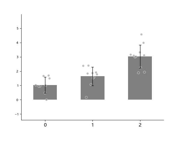
例如,我们有3组数据(分别有9个样本、10个样本、11个样本)通过柱状图展示它们之间的差异。
import numpy as np
from plotfig import plot_one_group_bar_figure

data1 = np.random.normal(1, 1, 9)
data2 = np.random.normal(2, 1, 10)
data3 = np.random.normal(3, 1, 11)

ax = plot_one_group_bar_figure([data1, data2, data3])
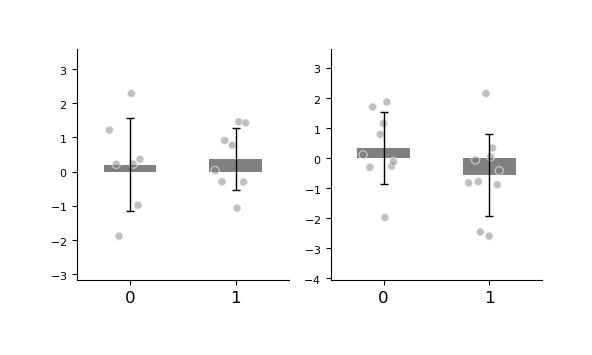
多子图
借助 matplotlib,我们可以在外部预先创建 figure 和 axes,从而灵活绘制多个子图,实现更复杂的图形布局。
关于更高级的子图排版方式,详见matplotlib中的教程。
import numpy as np
import matplotlib.pyplot as plt
from plotfig import plot_one_group_bar_figure

ax1_bar1 = np.random.normal(0, 1, 7)
ax1_bar2 = np.random.normal(0, 1, 8)
ax2_bar1 = np.random.normal(0, 1, 9)
ax2_bar2 = np.random.normal(0, 1, 10)

fig, axes = plt.subplots(1, 2, figsize=(6, 3))

ax1 = plot_one_group_bar_figure([ax1_bar1, ax1_bar2], ax=axes[0])
ax2 = plot_one_group_bar_figure([ax2_bar1, ax2_bar2], ax=axes[1])
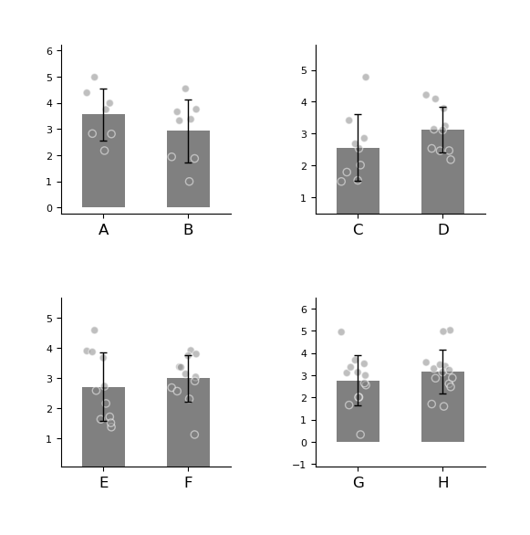
更多 axes 。
import numpy as np
import matplotlib.pyplot as plt
from plotfig import plot_one_group_bar_figure

ax1_bar1 = np.random.normal(3, 1, 7)
ax1_bar2 = np.random.normal(3, 1, 8)
ax2_bar1 = np.random.normal(3, 1, 9)
ax2_bar2 = np.random.normal(3, 1, 10)
ax3_bar1 = np.random.normal(3, 1, 11)
ax3_bar2 = np.random.normal(3, 1, 12)
ax4_bar1 = np.random.normal(3, 1, 13)
ax4_bar2 = np.random.normal(3, 1, 14)


fig, axes = plt.subplots(2, 2, figsize=(6, 6))
fig.subplots_adjust(wspace=0.5, hspace=0.5)

ax1 = plot_one_group_bar_figure([ax1_bar1, ax1_bar2], ax=axes[0,0], labels_name=["A", "B"])
ax2 = plot_one_group_bar_figure([ax2_bar1, ax2_bar2], ax=axes[0,1], labels_name=["C", "D"])
ax3 = plot_one_group_bar_figure([ax3_bar1, ax3_bar2], ax=axes[1,0], labels_name=["E", "F"])
ax4 = plot_one_group_bar_figure([ax4_bar1, ax4_bar2], ax=axes[1,1], labels_name=["G", "H"])
图的美化
参数设置
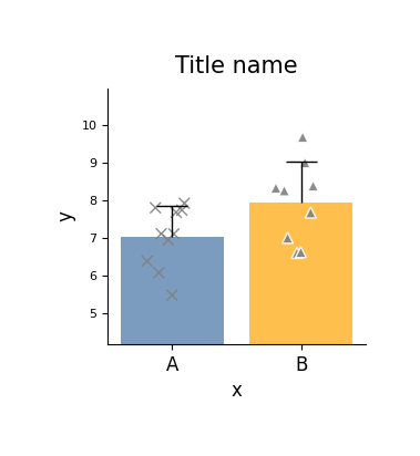
我们可以在外部创建 fig 对象,以便灵活控制图像大小。
plotfig 提供了丰富的选项用于自定义图形样式。
下面展示的是 plot_one_group_bar_figure 函数中部分常用参数的示例用法。
完整参数说明请参阅 plot_one_group_bar_figure 的 API 文档。
import numpy as np
import matplotlib.pyplot as plt
from plotfig import plot_one_group_bar_figure

data1 = np.random.normal(7, 1, 10)
data2 = np.random.normal(8, 1, 9)

fig, ax = plt.subplots(figsize=(3, 3))

ax = plot_one_group_bar_figure(
    [data1, data2],
    ax=ax,
    labels_name=["A", "B"],
    x_label_name="x",
    y_label_name="y",
    title_name="Title name",
    title_fontsize=15,
    width=0.8,
    show_dots=True,
    dots_size=50,
    dots_alpha=0.9,
    dots_markers=["x", "^"],
    colors=["#4573a5", "orange"],
    color_alpha=0.7,
    errorbar_type="sd",
    errorbar_mode="upper",
    errorbar_capsize=10,
)
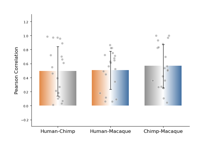
plot_one_group_bar_figure 支持将柱状图绘制为渐变色样式,适用于展示不同对象之间的关联结果。
例如,当我们计算了“人-黑猩猩、人-猕猴、黑猩猩-猕猴”之间的同源脑区(共 20 个)结构连接的 Pearson 相关性时,可以考虑使用这种方式进行可视化展示。
import numpy as np
import matplotlib.pyplot as plt
from plotfig import plot_one_group_bar_figure


human_color = "#e38a48"
chimp_color = "#919191"
macaque_color = "#4573a5"

human_chimp = np.random.random(20)
human_macaque = np.random.random(20)
chimp_macaque = np.random.random(20)

fig, ax = plt.subplots(figsize=(7, 5))

ax = plot_one_group_bar_figure(
    [human_chimp, human_macaque, chimp_macaque],
    ax=ax,
    labels_name=["Human-Chimp", "Human-Macaque", "Chimp-Macaque"],
    y_label_name="Pearson Correlation",
    width=0.7,
    gradient_color=True,
    colors_start=[human_color, human_color, chimp_color],
    colors_end=[chimp_color, macaque_color, macaque_color],
)
关于x轴
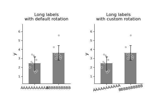
当 x 轴标签较长时,可以通过旋转角度来避免重叠,提升可读性。
import numpy as np
import matplotlib.pyplot as plt
from plotfig import plot_one_group_bar_figure

data1 = np.random.normal(3, 1, 10)
data2 = np.random.normal(4, 1, 9)

fig, axes = plt.subplots(1, 2, figsize=(6, 3))
fig.subplots_adjust(wspace=0.5)

ax1 = plot_one_group_bar_figure(
    [data1, data2],
    ax=axes[0],
    x_tick_fontsize=10,
    labels_name=["AAAAAAAAAAA", "BBBBBBBBBB"],
    y_label_name="y",
    title_name="Long labels\nwith default rotation",
)
ax2 = plot_one_group_bar_figure(
    [data1, data2],
    ax=axes[1],
    x_tick_fontsize=10,
    labels_name=["AAAAAAAAAAA", "BBBBBBBBBB"],
    y_label_name="y",
    title_name="Long labels\nwith custom rotation",
    x_tick_rotation=10,
    x_label_ha="center",
)
关于y轴
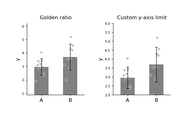
plot_one_group_bar_figure 默认会自动计算最高点与最低点之间的距离,并将其设置为 y 轴长度的 0.618(即黄金比例),以优化视觉效果。
如果希望手动设置 y 轴范围,可以使用 y_lim 参数来自定义。
import numpy as np
import matplotlib.pyplot as plt
from plotfig import plot_one_group_bar_figure

data1 = np.random.normal(3, 1, 10)
data2 = np.random.normal(4, 1, 9)

fig, axes = plt.subplots(1, 2, figsize=(6, 3))
fig.subplots_adjust(wspace=0.5)

ax1 = plot_one_group_bar_figure(
    [data1, data2],
    ax=axes[0],
    labels_name=["A", "B"],
    y_label_name="y",
    title_name="Golden ratio",
)
ax2 = plot_one_group_bar_figure(
    [data1, data2],
    ax=axes[1],
    labels_name=["A", "B"],
    y_label_name="y",
    title_name="Custom y-axis limit",
    y_lim=(2, 6)
)
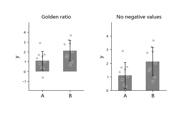
有时我们希望将 ax 的底端固定为 0,但不确定最大刻度的具体数值,可以使用 ax_bottom_is_0 来设置 ax 底端固定为0。
import numpy as np
import matplotlib.pyplot as plt
from plotfig import plot_one_group_bar_figure

data1 = np.random.normal(1,  1, 10)
data2 = np.random.normal(2, 1, 9)

fig, axes = plt.subplots(1, 2, figsize=(6, 3))
fig.subplots_adjust(wspace=0.5)

ax1 = plot_one_group_bar_figure(
    [data1, data2],
    ax=axes[0],
    labels_name=["A", "B"],
    y_label_name="y",
    title_name="Golden ratio",
)
ax2 = plot_one_group_bar_figure(
    [data1, data2],
    ax=axes[1],
    labels_name=["A", "B"],
    y_label_name="y",
    title_name="No negative values",
    ax_bottom_is_0=True,
)
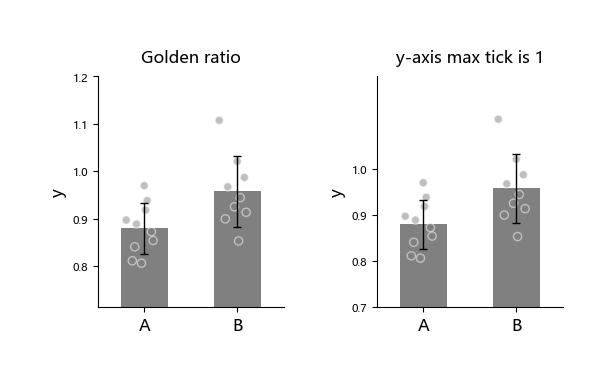
有时我们希望将 y 轴的刻度最大值限制为 1,例如当 y 轴表示经过 Fisher z 转换的相关系数时,可以设置y_max_tick_to_one来固定 y 轴的刻度最大值为1。
import numpy as np
import matplotlib.pyplot as plt
from plotfig import plot_one_group_bar_figure

data1 = np.random.normal(0.9, 0.1, 10)
data2 = np.random.normal(0.9, 0.1, 9)

fig, axes = plt.subplots(1, 2, figsize=(6, 3))
fig.subplots_adjust(wspace=0.5)

ax1 = plot_one_group_bar_figure(
    [data1, data2],
    ax=axes[0],
    labels_name=["A", "B"],
    y_label_name="y",
    title_name="Golden ratio",
)
ax2 = plot_one_group_bar_figure(
    [data1, data2],
    ax=axes[1],
    labels_name=["A", "B"],
    y_label_name="y",
    title_name="y-axis max tick is 1",
    y_max_tick_is_1=True,
)
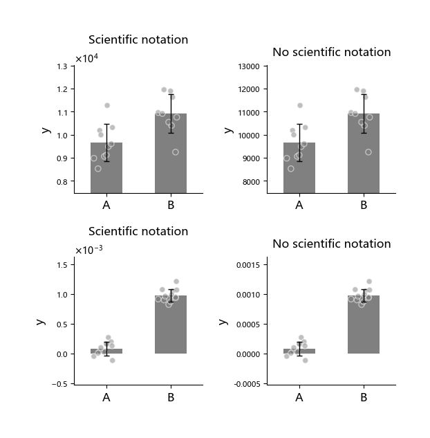
有时我们可能希望更改 y 轴的显示格式,例如使用科学计数法来呈现数值,可以使用 math_text 参数来设置。
import numpy as np
import matplotlib.pyplot as plt
from plotfig import plot_one_group_bar_figure

data1 = np.random.normal(10000, 1000, 10)
data2 = np.random.normal(11000, 1000, 9)
data3 = np.random.normal(0.0001, 0.0001, 11)
data4 = np.random.normal(0.001, 0.0001, 12)

fig, axes = plt.subplots(2, 2, figsize=(6, 6))
fig.subplots_adjust(wspace=0.5, hspace=0.5)

ax1 = plot_one_group_bar_figure(
    [data1, data2],
    ax=axes[0,0],
    labels_name=["A", "B"],
    y_label_name="y",
    title_name="Scientific notation",
)
ax2 = plot_one_group_bar_figure(
    [data1, data2],
    ax=axes[0,1],
    labels_name=["A", "B"],
    y_label_name="y",
    title_name="No scientific notation",
    math_text=False,
)
ax3 = plot_one_group_bar_figure(
    [data3, data4],
    ax=axes[1,0],
    labels_name=["A", "B"],
    y_label_name="y",
    title_name="Scientific notation",
)
ax4 = plot_one_group_bar_figure(
    [data3, data4],
    ax=axes[1,1],
    labels_name=["A", "B"],
    y_label_name="y",
    title_name="No scientific notation",
    math_text=False,
)
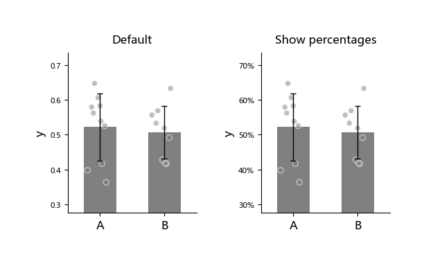
有时我们希望将 Y 轴显示为百分比格式。
Warning
percentage 格式会与 math_text 冲突。
而math_text 默认打开,需显式关闭。
import numpy as np
import matplotlib.pyplot as plt
from plotfig import plot_one_group_bar_figure

data1 = np.random.normal(0.5,  0.1, 10)
data2 = np.random.normal(0.5, 0.1, 9)

fig, axes = plt.subplots(1, 2, figsize=(6, 3))
fig.subplots_adjust(wspace=0.5)

ax1 = plot_one_group_bar_figure(
    [data1, data2],
    ax=axes[0],
    labels_name=["A", "B"],
    y_label_name="y",
    title_name="Default",
)
ax2 = plot_one_group_bar_figure(
    [data1, data2],
    ax=axes[1],
    labels_name=["A", "B"],
    y_label_name="y",
    title_name="Show percentages",
    math_text=False,
    percentage=True,
)
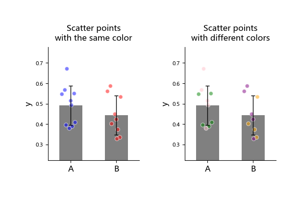
关于散点
plot_one_group_bar_figure 允许为每个散点分配颜色,可用于区分不同来源的数据。
import numpy as np
import matplotlib.pyplot as plt
from plotfig import plot_one_group_bar_figure

data1 = np.random.normal(0.5,  0.1, 10)
data2 = np.random.normal(0.5, 0.1, 9)

dots_color1 = [["blue"]*10, ["red"]*9]
dots_color2 = [["green"]*5+["pink"]*5, ["orange"]*4+["purple"]*5]

fig, axes = plt.subplots(1, 2, figsize=(6, 3))
fig.subplots_adjust(wspace=0.5)

ax1 = plot_one_group_bar_figure(
    [data1, data2],
    ax=axes[0],
    labels_name=["A", "B"],
    y_label_name="y",
    title_name="Scatter points\nwith the same color",
    dots_color=dots_color1,  # 散点颜色
)
ax2 = plot_one_group_bar_figure(
    [data1, data2],
    ax=axes[1],
    labels_name=["A", "B"],
    y_label_name="y",
    title_name="Scatter points\nwith different colors",
    dots_color=dots_color2,
)
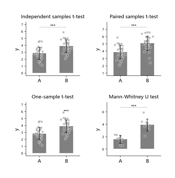
统计
plot_one_group_bar_figure 可快速实现柱间统计比较。当前支持以下统计方法:
- 独立样本 t 检验(
ttest_ind) - 配对样本 t 检验(
ttest_rel) - 单样本 t 检验(
ttest_1samp) - Mann-Whitney U 检验(
mannwhitneyu) - 外部统计检验 (
external)
使用时需先通过 statistic 选项启用统计功能,并在 test_method 中指定方法名。
import numpy as np
import matplotlib.pyplot as plt
from plotfig import plot_one_group_bar_figure

np.random.seed(42)

data1 = np.random.normal(3, 1, 30)
data2 = np.random.normal(4, 1, 31)
data3 = np.random.normal(5, 1, 31)
data4 = np.random.normal(2, 1, 9)
data5 = np.random.normal(4, 1, 10)

fig, axes = plt.subplots(2, 2, figsize=(6, 6))
fig.subplots_adjust(wspace=0.5, hspace=0.5)

ax1 = plot_one_group_bar_figure(
    [data1, data2],
    ax=axes[0,0],
    labels_name=["A", "B"],
    y_label_name="y",
    title_name="Independent samples t-test",
    statistic=True,
    test_method=["ttest_ind"]
)
ax2 = plot_one_group_bar_figure(
    [data2, data3],
    ax=axes[0,1],
    labels_name=["A", "B"],
    y_label_name="y",
    title_name="Paired samples t-test",
    statistic=True,
    test_method=["ttest_rel"]
)
ax3 = plot_one_group_bar_figure(
    [data1, data2],
    ax=axes[1,0],
    labels_name=["A", "B"],
    y_label_name="y",
    title_name="One-sample t-test",
    statistic=True,
    test_method=["ttest_1samp"],
    popmean=3,
)
ax4 = plot_one_group_bar_figure(
    [data4, data5],
    ax=axes[1,1],
    labels_name=["A", "B"],
    y_label_name="y",
    title_name="Mann-Whitney U test",
    statistic=True,
    test_method=["mannwhitneyu"]
)
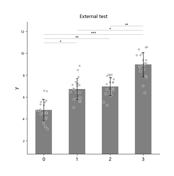
“外部统计检验”(external)指用户可使用其他统计软件完成检验,只需将计算好的 p 值传入函数。
外部统计检验需通过 p_list 额外传入对应的 p 值列表。
Note
当使用“外部统计检验”且有多个柱子需要比较时,传入的 p 值应遵循以下顺序:
- 1 → 2、1 → 3、…、1 → n
- 2 → 3、2 → 4、…、2 → n
- 依此类推
import numpy as np
import matplotlib.pyplot as plt
from plotfig import plot_one_group_bar_figure

np.random.seed(42)

data1 = np.random.normal(5,  1, 20)
data2 = np.random.normal(7, 1, 20)
data3 = np.random.normal(7, 1, 20)
data4 = np.random.normal(9, 1, 20)

p_list = [0.05, 0.01, 0.001, 1, 0.05, 0.01]

fig, ax = plt.subplots(figsize=(6, 6))

ax = plot_one_group_bar_figure(
    [data1, data2, data3, data4],
    ax=ax,
    y_label_name="y",
    title_name="External test",
    statistic=True,
    test_method=["external"],
    p_list=p_list,
)
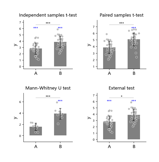
以下4种统计均可以与单样本t检验ttest_1samp同时执行:
1. 独立样本 t 检验(ttest_ind)
2. 配对样本 t 检验(ttest_rel)
3. Mann-Whitney U 检验(mannwhitneyu)
4. 外部统计检验 (external)
即在同一张子图中执行2种检验。
import numpy as np
import matplotlib.pyplot as plt
from plotfig import plot_one_group_bar_figure

np.random.seed(42)

data1 = np.random.normal(3, 1, 30)
data2 = np.random.normal(4, 1, 31)
data3 = np.random.normal(5, 1, 31)
data4 = np.random.normal(2, 1, 9)
data5 = np.random.normal(4, 1, 10)

fig, axes = plt.subplots(2, 2, figsize=(6, 6))
fig.subplots_adjust(wspace=0.5, hspace=0.5)

ax1 = plot_one_group_bar_figure(
    [data1, data2],
    ax=axes[0,0],
    labels_name=["A", "B"],
    y_label_name="y",
    title_name="Independent samples t-test",
    statistic=True,
    test_method=["ttest_ind", "ttest_1samp"],
    popmean=0
)
ax2 = plot_one_group_bar_figure(
    [data2, data3],
    ax=axes[0,1],
    labels_name=["A", "B"],
    y_label_name="y",
    title_name="Paired samples t-test",
    statistic=True,
    test_method=["ttest_rel", "ttest_1samp"],
    popmean=4,
)
ax3 = plot_one_group_bar_figure(
    [data4, data5],
    ax=axes[1,0],
    labels_name=["A", "B"],
    y_label_name="y",
    title_name="Mann-Whitney U test",
    statistic=True,
    test_method=["mannwhitneyu", "ttest_1samp"],
    popmean=2,
)
ax4 = plot_one_group_bar_figure(
    [data1, data2],
    ax=axes[1,1],
    labels_name=["A", "B"],
    y_label_name="y",
    title_name="External test",
    statistic=True,
    test_method=["external", "ttest_1samp"],
    p_list=[0.05],
    popmean=0,
)
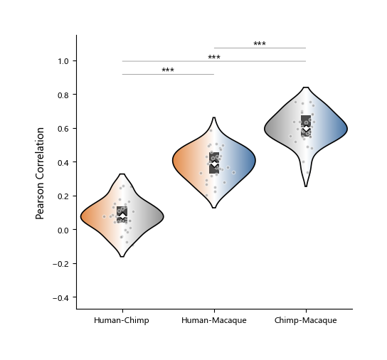
单组小提琴图
小提琴图(violin plot)是一种结合箱线图(box plot)和核密度估计图(density plot)特点的可视化工具,用于展示数据的分布情况。 它不仅显示数据的均值(白色菱形)、中位数(白线)、四分位数等统计信息(黑色矩形), 还通过对称的核密度曲线,直观反映数据在不同取值区间的分布形态。
相比传统箱线图,小提琴图能更全面揭示数据的多峰性、偏态等特征,适合比较多个组别的分布差异。 当数据分布不均匀,且采用非参数统计方法时,使用小琴图展示往往更为合适。
在 plotfig 中,绘制小提琴图的函数名为 plot_one_group_violin_figure。
其大部分参数与 plot_one_group_bar_figure 相似,以下是部分演示。
完整参数说明请参阅 plot_one_group_violin_figure 的 API 文档。
import numpy as np
import matplotlib.pyplot as plt
from plotfig import plot_one_group_violin_figure

human_color = "#e38a48"
chimp_color = "#919191"
macaque_color = "#4573a5"

np.random.seed(42)

human_chimp = 0.1 + np.random.normal(0, 0.1, 30)
human_macaque = 0.4 + np.random.normal(0, 0.1, 30)
chimp_macaque = 0.6 + np.random.normal(0, 0.1, 30)

fig, ax = plt.subplots(figsize=(5,5))

ax = plot_one_group_violin_figure(
    [human_chimp, human_macaque, chimp_macaque],
    ax=ax,
    labels_name=["Human-Chimp", "Human-Macaque", "Chimp-Macaque"],
    y_label_name="Pearson Correlation",
    width=0.9,
    show_dots=True,
    dots_size=10,
    gradient_color=True,
    colors_start= [human_color, human_color, chimp_color],
    colors_end= [chimp_color, macaque_color, macaque_color],
    statistic=True,
    test_method=["mannwhitneyu"]
)